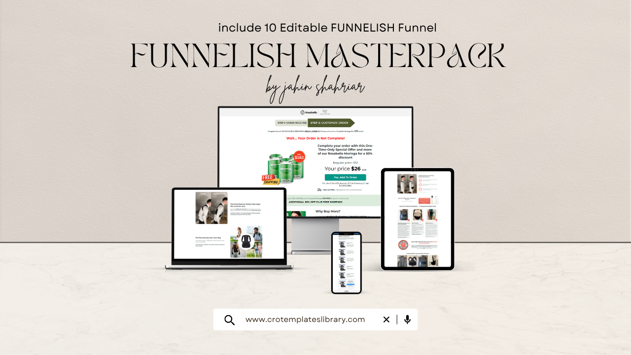
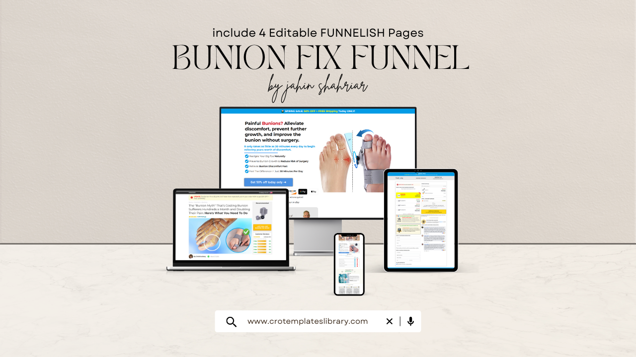
If you've been hunting for the most effective Funnelish templates to run with paid advertising in 2026, this guide cuts through the noise. These five picks have been selected based on real conversion performance, structural soundness, and their ability to scale across different ad platforms and product categories.
What Is Funnelish?
Funnelish is a dedicated funnel-building tool engineered specifically for Shopify merchants running paid traffic campaigns. While most page builders like GemPages or PageFly are designed for organic store browsing, Funnelish is built from the ground up for the cold traffic buyer journey — the person who clicked a Facebook or TikTok ad and has no idea who you are yet.
Its core architecture revolves around advertorial-style entry pages, seamless one-click upsell flows, and mobile-first layouts calibrated for the exact behavior patterns of social media shoppers.
If you're still sending paid ad traffic directly to a standard Shopify product page, you're leaving significant revenue on the table. A proper Funnelish funnel creates a structured path: advertorial → product page → post-purchase upsell — and each stage does a specific job in moving the buyer from curious to convinced to converted.
How to Pick the Right Funnelish Template
Before jumping into the list, run your product through these four filtering questions. They'll narrow your choice down fast.
Where is your traffic coming from?
Cold traffic arriving from Facebook or TikTok needs a warm-up layer — an advertorial that builds context before the price ever appears. Warm traffic from email lists or retargeting campaigns responds better to a leaner, faster layout that gets out of the buyer's way.
Who exactly is your buyer?
Audiences over 45 tend to trust authority-driven layouts — visible trust badges, clinical-style formatting, and credibility signals placed early. Younger buyers drawn in through TikTok connect more with emotional storytelling and content that feels user-generated rather than polished.
What does your product cost?
Higher-ticket items in the $60–$120+ range require more content to justify the spend — more proof, more ingredient or benefit explanation, more social validation. Lower-priced products convert better when the funnel is lean and frictionless, getting the buyer to checkout before hesitation sets in.
What does your buyer need to understand before they'll commit?
If your product contains unfamiliar ingredients or makes claims outside mainstream awareness, you need an education layer that explains the mechanism before the offer lands. If the product category is already well understood, skip the explanation and lead with results — buyers already know they want it, they just need a reason to trust you.
At a Glance — Top 5 Funnelish Templates
A quick comparison before diving into the full breakdowns below.
| # | Template Name | Best For |
|---|---|---|
| 01 | Rosabella Funnel | 🌿 Health & Wellness |
| 02 | Olavita Anti Aging Serum | 🌸 Beauty & Skincare |
| 03 | Nooro Whole Body Massager | 💪 Health & Pain Relief |
| 04 | Nooro Foot Massager | 🦶 EMS & Foot Care |
| 05 | Koprez Foot Sleeves | 🩹 Compression & Foot Care |
The Top 5 Funnelish Templates in 2026
🌿 Health & Wellness
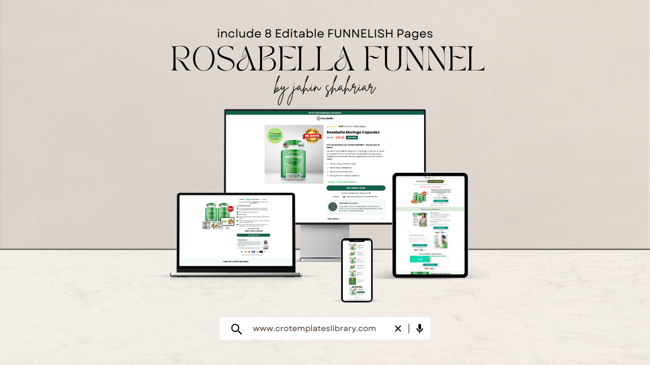
Rosabella Funnel — Highest Converting Supplement Funnel
The Rosabella Funnel sits at the top of this list for one specific reason: it was designed to sell health and wellness supplements to cold audiences who have never heard of your brand, your ingredient, or your product. That is arguably the hardest conversion challenge in paid advertising.
The template's story-led advertorial structure pulls the reader into a recognizable health narrative before the product even enters the picture. A buyer scrolling through their Facebook feed doesn't know what Moringa is, doesn't know they need it, and certainly doesn't trust a brand they've never seen. This funnel earns that trust by opening with a problem the reader already lives with — low energy, poor digestion, nutritional gaps — and walking them through a narrative that makes the solution feel logical rather than salesy.
CTA placements are distributed strategically throughout the page, allowing conversions to happen at multiple scroll depths rather than relying on buyers to make it all the way to the bottom.
Why it works in 2026
Supplement advertising on Meta and TikTok faces more skepticism than almost any other product category. Buyers have been burned by overblown claims before, and ad algorithms penalize high-bounce destinations. An advertorial that reads like informative content — rather than an ad — earns longer read times, lower bounce rates, and far more purchase confidence by the time the offer appears.
What's included
- ✓Proven listicle-style advertorial layout
- ✓Clean, structured product presentation
- ✓Custom checkout page design
- ✓Emotional hook section above the fold
- ✓Multiple CTA placements for varied scroll depths
- ✓Fully mobile responsive
🌸 Beauty & Skincare
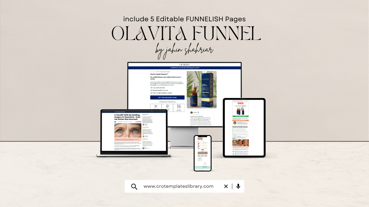
Olavita Anti Aging Serum Funnel — Highest Converting Beauty Funnel
The Olavita template was engineered for one of the most difficult buyers in the entire beauty market: a woman between 35 and 65 who has purchased and been disappointed by more serums than she can count. She has heard every ingredient name, been promised every result, and grown deeply skeptical of advertising claims.
Reaching her requires a fundamentally different approach. Instead of leading with product features or before-and-after images, this funnel opens with her frustration — not your solution. By the time the product is introduced, the reader has already found herself in the narrative, felt understood, worked through the science at her own pace, and arrived at the offer feeling educated rather than sold to.
That sequence — frustration, empathy, education, offer — is one that a standard product page simply cannot replicate for cold traffic.
Why it works in 2026
Anti-aging beauty is among the most skepticism-heavy categories in paid advertising. Over-promised products have trained buyers to dismiss marketing language quickly. A funnel that reads like editorial content rather than advertising earns deeper scroll engagement, and gives the ingredient science — Argireline, hydrolyzed collagen peptides, hyaluronic acid — the page real estate it needs to actually register before the call to action appears.
What's included
- ✓Proven five-reasons listicle layout
- ✓Before and after comparison sections
- ✓Educational ingredient content blocks
- ✓100% mobile responsive design
💪 Health & Pain Relief
Nooro Whole Body Massager Funnel — Authority-Led Medical Style Design
When your product targets a buyer over 45 dealing with chronic pain or physical discomfort, trust is not a nice-to-have — it's the conversion variable. The Nooro Whole Body Massager template is structured around that insight. Its medical-style authority layout communicates credibility before a single scroll happens, using formatting and visual language that signals this is a serious product with genuine support behind it.
Built-in testimonial sections, trust badges, guarantee blocks, and benefit breakdowns all appear early — before the buyer faces any purchase decision. This removes the psychological friction that kills conversions in health-adjacent categories. Buyers feel reassured before they've even finished reading.
The post-purchase upsell flow is a major structural advantage baked directly into the template. Rather than requiring separate setup, the upsell funnel is part of the design — allowing additional revenue capture from buyers who have already converted, without any additional ad spend.
Why it works in 2026
Health product advertising on Meta is under increasing scrutiny. Layouts that lead with authority, proof, and clinical-looking structure earn better ad approval outcomes and generate stronger buyer confidence than aggressive, hype-driven copy styles.
What's included
- ✓Medical-style authority layout
- ✓Built-in testimonial section
- ✓Visible trust badges and guarantee blocks
- ✓Clear benefits breakdown section
- ✓FAQ section included
- ✓Post-purchase upsell flow
🦶 EMS & Foot Care
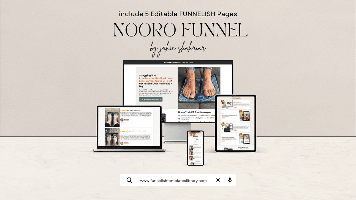
Nooro Foot Massager Funnel — Pain-Point Focused with Sticky CTA
This template makes a case for being the best structural value in this entire category. The pain-targeting headline does the heavy lifting above the fold — it names the buyer's exact frustration with enough specificity to stop their scroll and make them feel seen.
The defining structural feature is the sticky CTA bar on mobile. As a buyer reads through the funnel, the purchase button remains visible at all times. For physical products on mobile devices, this single feature can produce a meaningful lift in conversion rate by eliminating one of the most common sources of friction — the moment when a ready buyer has to scroll back up to find where to actually purchase.
The full funnel architecture is included in the template: advertorial introduction, product page, and post-purchase upsell flow. Nothing needs to be built from scratch or connected separately.
Why it works in 2026
EMS and foot care products draw heavily from older demographics who are comfortable browsing on mobile but sometimes less confident completing online purchases. A sticky CTA, unambiguous trust elements, and a pain-led entry point address the three friction points that most commonly prevent that buyer from finishing checkout.
What's included
- ✓Pain-targeting headline structure
- ✓Guarantee and trust elements
- ✓Optimized for older demographics
- ✓Sticky CTA bar on mobile
- ✓Complete funnel: Advertorial → Product Page → Upsell
- ✓Instant delivery via share link
🩹 Compression & Foot Care
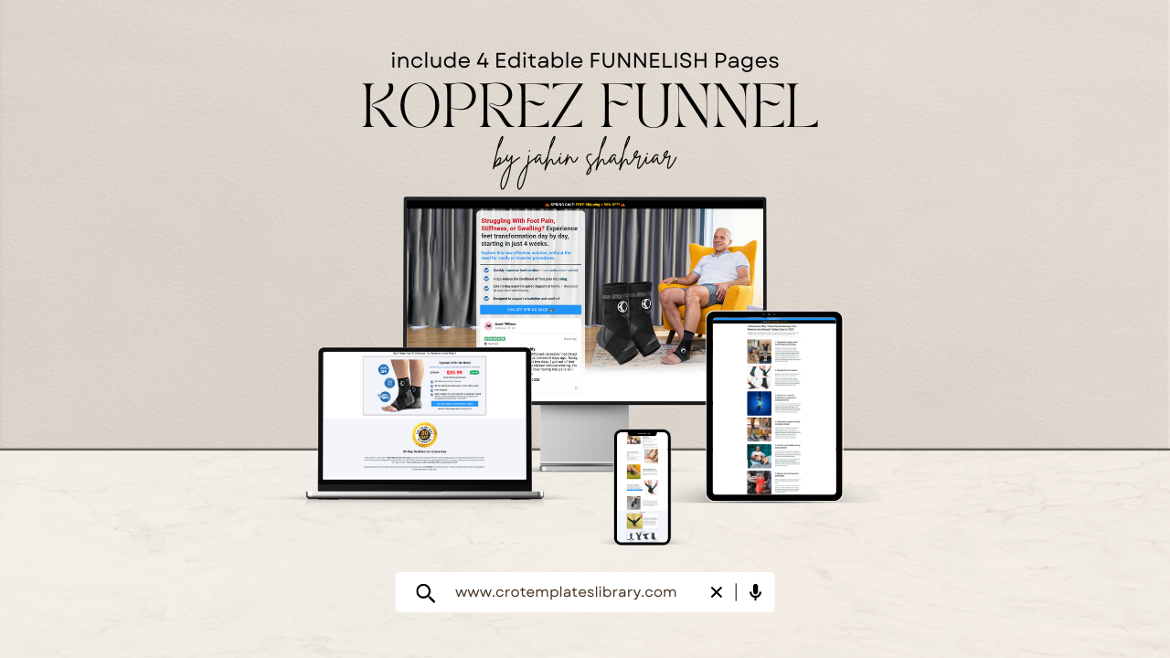
Koprez Foot Sleeves Funnel — Minimal, Direct, and Built for Speed
The Koprez template takes a deliberately opposite approach to every other funnel on this list. There is no extended advertorial, no lengthy ingredient education, no emotional warm-up narrative. It is a lean, direct, mobile-optimized funnel designed to move warm buyers from landing to checkout as efficiently as possible.
This structure is correct when the buyer already knows what the product is and why they'd want it. Compression sleeves and foot support products occupy a well-understood category — buyers don't need to be educated on what they are. They arrive on the page already interested. What they need is a fast, trustworthy path to purchase, not a funnel that delays the offer with content they don't require.
Why it works in 2026
As the cost of paid traffic continues to rise, warm traffic and retargeting audiences represent increasingly important budget allocations. This template exists to maximize conversion efficiency with those buyers — removing every unnecessary step between initial interest and completed checkout.
What's included
- ✓Minimal, direct layout
- ✓Mobile-first design
- ✓Fast-loading page structure
- ✓Optimized specifically for warm traffic
Why These Templates Outperform Standard Shopify Pages in 2026
Advertising costs on Meta and TikTok have climbed consistently over the past several years. Profitability for most brands no longer comes from spending more — it comes from converting a higher percentage of the traffic they're already paying for.
A standard Shopify product page is designed for a buyer who has already decided they want something and is browsing to confirm their choice. It assumes awareness, intent, and brand familiarity. A Funnelish template is designed for the opposite scenario: a complete stranger who clicked an ad, arrived with no prior knowledge, and needs to be educated, reassured, and convinced before they'll enter their payment details.
These templates deliver on four structural requirements:
🏗️
Proven Conversion Architecture
Built on funnel structures validated with real paid traffic campaigns — not theoretical best practices.
📱
Mobile-First at Every Level
Over 90% of social ad traffic lands on mobile. These templates treat mobile speed and usability as the primary consideration, not an afterthought.
🎯
Built Around Cold Traffic Behavior
Advertorial layouts, above-the-fold emotional hooks, and trust elements calibrated specifically for Facebook and TikTok audiences.
📈
Designed to Scale
Import once, duplicate easily, and test variations without rebuilding. Structured for A/B testing and scaling from day one.
Frequently Asked Questions
Common questions about Funnelish templates, setup, and compatibility.
Conclusion
The templates covered in this guide represent five distinct approaches to the same core challenge: converting a cold paid traffic visitor into a paying customer before they leave your page. Each one is built for a specific product type, buyer psychology, and traffic temperature — and choosing the right match is as important as the template quality itself.
Use the four filtering questions at the top of this guide to anchor your decision in the reality of your own product, price point, and audience. A supplement brand targeting women over 50 on Facebook needs a fundamentally different structure than a compression sleeve brand retargeting warm buyers on Instagram — and the templates reflect those differences by design.
The common thread across all five is that they were built around how paid traffic buyers actually behave — not how an ideal customer browsing an organic store might. In a paid ads environment where margins are tighter and every click costs more than it did a year ago, that structural alignment between template and traffic source is what separates a profitable funnel from an expensive one.